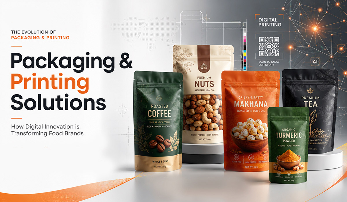
Beyond the Wrapper: The Ultimate Guide to Protein Bar Branding and Packaging
Minimalist Matte Finishes
A clean, modern look with matte textures conveys sophistication and simplicity. Matte packaging for bars exudes elegance while keeping distractions minimal, making the brand appear more premium.

Eco-Friendly Kraft Paper Wrapping
Sustainable, biodegradable materials appeal to eco-conscious consumers and give a natural, organic feel. Using uncoated kraft paper with minimalist black or white typography creates a rustic yet stylish appearance.

Transparent Window Packaging
Showcasing the bar’s ingredients builds trust and highlights its natural components. A clear section in the packaging allows customers to see the real ingredients, reinforcing transparency and quality. This packaging of bars can make it look more elegant.
Metallic Foil Accents
Adding gold, silver, or copper foil details gives a premium and high-energy look. Metallic finishes reflect light beautifully, making the product stand out while evoking luxury and performance.
Bold Typography & High-Contrast Colours
Strong fonts and vibrant colours create an eye-catching, powerful impact. Large, dynamic typography paired with contrasting colours (e.g., black and yellow) conveys a sense of energy and movement.
Customizable Labelling
Personalized packaging for bars allows consumers to add names or motivational messages. Brands can include QR codes or digital customization options, letting buyers create unique, individualized wrappers.

Unique Die-Cut Shapes
Innovative cutouts or dynamic edges make packaging instantly recognizable. Instead of a standard rectangular shape, consider angular or asymmetrical designs to capture attention.
Holographic Printing
Eye-catching, futuristic designs attract attention and stand out in stores. Shiny, shifting colors give the packaging a high- tech, cutting-edge feel, appealing to younger and trend-conscious consumers.

Resealable Pouches
Perfect for those who snack throughout the day, adding convenience to the packaging. A zip-lock or resealable sticker helps maintain freshness and makes it easy to store partially eaten bars.

Gradient Colour Effects
Smooth colour transitions create a modern and visually appealing effect. Gradient backgrounds add depth, making packaging feel dynamic and contemporary.


Interactive QR Codes
Linking to nutritional facts, workout tips, or brand stories enhances customer engagement. Scanning the code can lead to exclusive discounts, loyalty programs, or even video content.

Transparent Minimalism
A barely-there design focusing on pure ingredients and simplicity. Clear packaging with minimalist branding lets the product itself do the talking, ideal for clean-label brands.
Comic Book-Inspired Graphics
A playful, energetic approach that appeals to fitness enthusiasts and younger consumers. Bright colors and action-packed designs make protein bars feel like a fun, powerful snack.
Athletic-Themed Packaging
Dynamic shapes and sports-related imagery create a strong performance-based appeal. Packaging can include visual elements like motion blur, sports equipment, or silhouettes of athletes.

Conclusion
Great packaging not only protects your protein bars but also tells a compelling brand story. Whether you aim for minimalism, luxury, or sustainability, an innovative packaging design can set your product apart. Experiment with materials, textures, and visuals to create a lasting impression on customers.
Which of these packaging ideas inspires you the most? Let us know in the comments below!