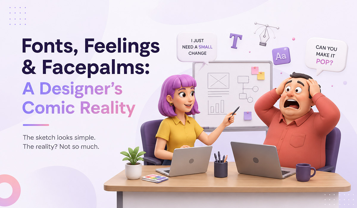
Fonts, Feelings & Facepalms: A Designer’s Comic Reality
Graphic design is a beautiful blend of creativity, color theory, and caffeine-fueled all-nighters. But let’s be real — between client calls that start with “I just need a small change” and feedback like “Can you make it pop?”, designers live in a world where logic meets lunacy. Every project has its own twist, especially when what designers say and what clients understand are two completely different languages. Whether it’s about fonts, spacing, or asking why a printed brochure doesn’t glow like a phone screen, we’ve all been there. So grab your coffee and join us as we decode 10 laugh-out-loud truths every graphic designer knows (and secretly cries about).
1. Font Fiasco: “Can you use a more fancy font? Like Comic Sans?”
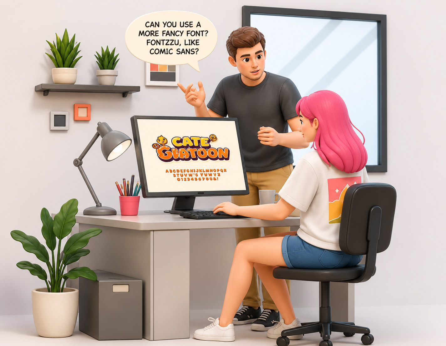
What Designers Say: “This is a premium serif with excellent readability and brand presence.”
What Clients Hear: “Can you add that font I saw in a wedding invite?”
Funny Truth: The battle between classy typography and “funky fonts” is never-ending.
2. Typography Confusion: "Make the text bigger. No, bigger than that."
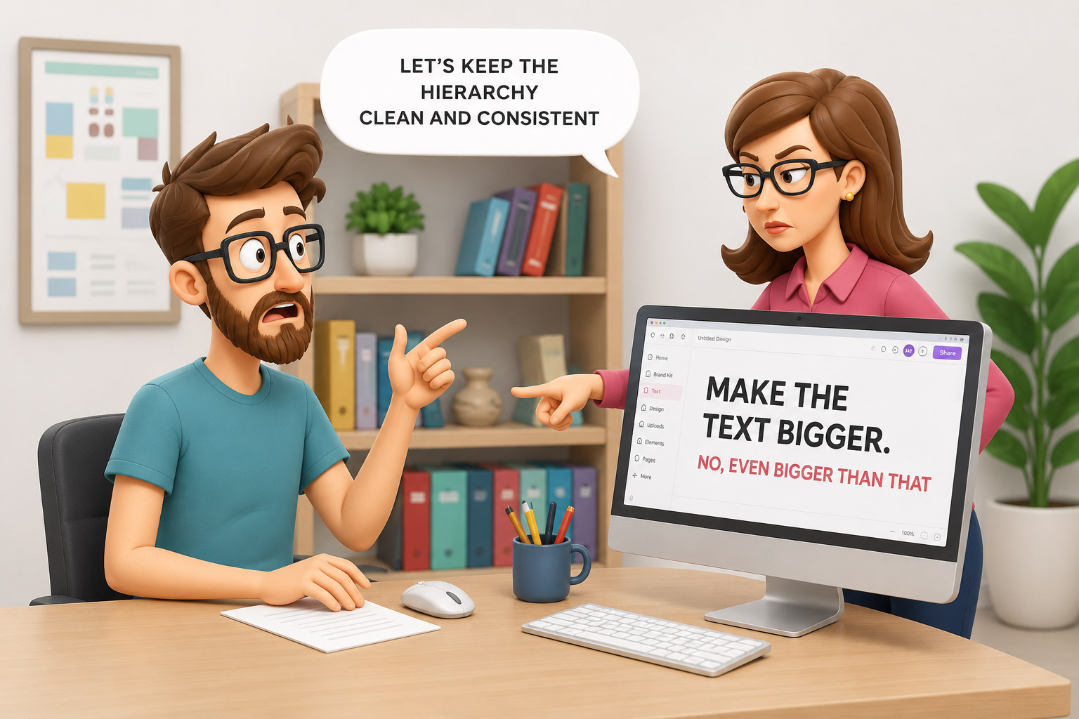
What Designers Say: “Let’s keep the hierarchy clean and consistent.”
What Clients Hear: “More text = more impact, so let’s fit a newspaper on a visiting card.”
Funny Truth: Typography is an art. But to clients, it’s just… “make it POP!”
3. Breathing Space Be Gone: "There’s too much empty space."
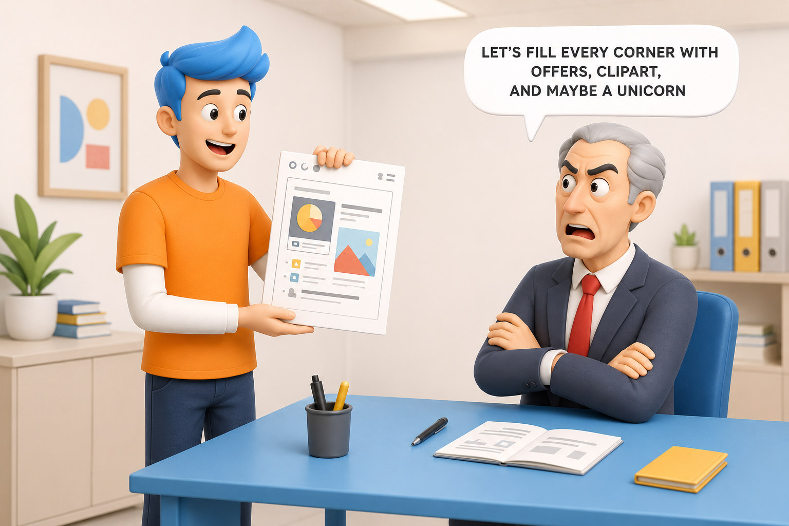
What Designers Say: “White space helps the design breathe.”
What Clients Hear: “Let’s fill every corner with offers, clipart, and maybe a unicorn.”
Funny Truth: If whitespace were a person, it would need therapy after client feedback.
4. Bleed Area Chaos: "Why is the printer chopping off my logo?"
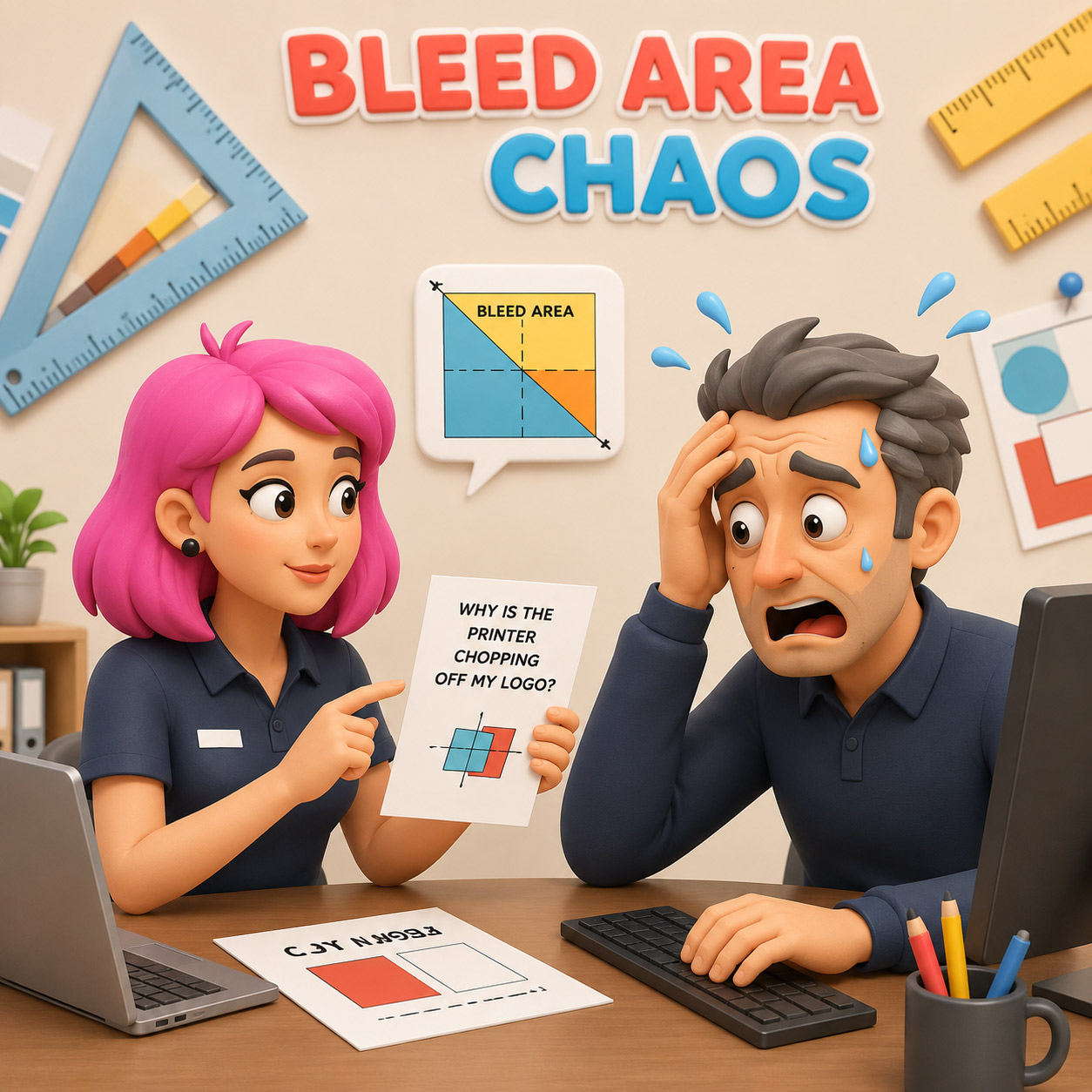
What Designers Say: “We’ve set a 3mm bleed and safe zone margins.”
What Clients Hear: “Margins? Like in notebooks?”
Funny Truth: The logo dancing at the edge of disaster — classic print trauma!
5. Fruit Switch Request: "Remove the mangoes from the tree and add oranges."
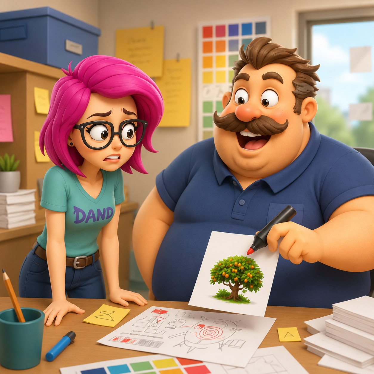
What Designers Say: “That’s a stock photo, we’ll need to retouch or recreate it.”
What Clients Hear: “Photoshop is magic, right? Just Ctrl+C, Ctrl+Orange.”
Funny Truth: Clients think Photoshop is Harry Potter’s wand. Designers know it’s a horror movie.
6. Animation Expectation: “Can this PNG be made into a full 3D animation?"
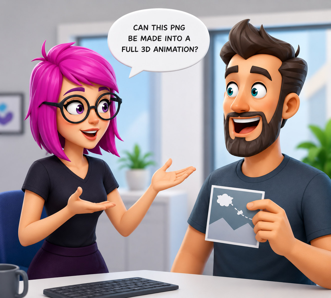
What Designers Say: “We’ll need to recreate the artwork in layers or use motion graphics.”
What Clients Hear: “Just make it move. Like Shahrukh’s arms in slow-mo.”
Funny Truth: That static banana image is not going to peel itself!
7. Lorem Ipsum Drama: "Why is the poster in Latin?"
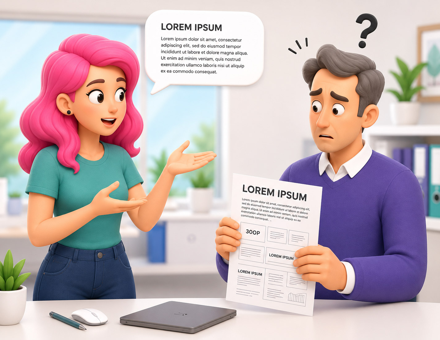
What Designers Say: “It’s placeholder text until you send the content.”
What Clients Hear: “They made a mistake. Call the content guy. Fire someone!”
Funny Truth: ‘Lorem Ipsum’ is every designer’s desperate cry for real content.
8. Color Confusion: "Can you make it a little light... no wait, a little dark... hmm somewhere in between?"
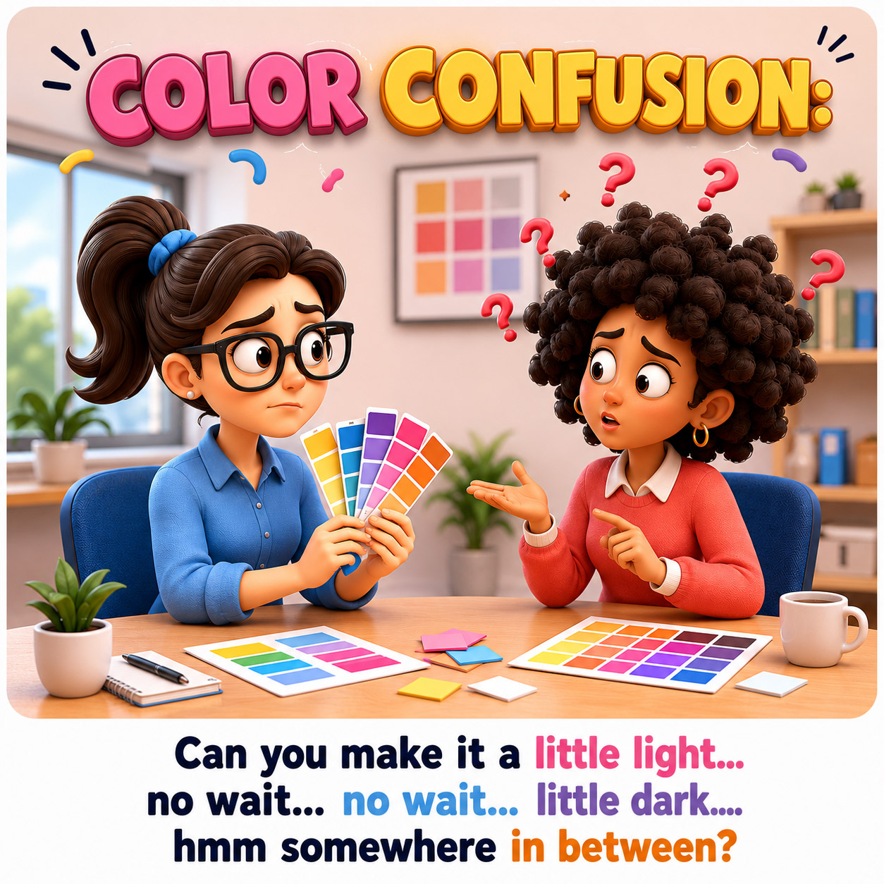
What Designers Say: “Let’s use a defined color palette with contrast and brand tone.”
What Clients Hear: “Just keep dragging the slider till I feel something.”
Funny Truth: It’s not color correction — it’s color confession therapy.
Bonus Line: One hour later: “I think the first version was better.”
9. DIY Designer Client: "I also know little Photoshop, so I made some small changes."
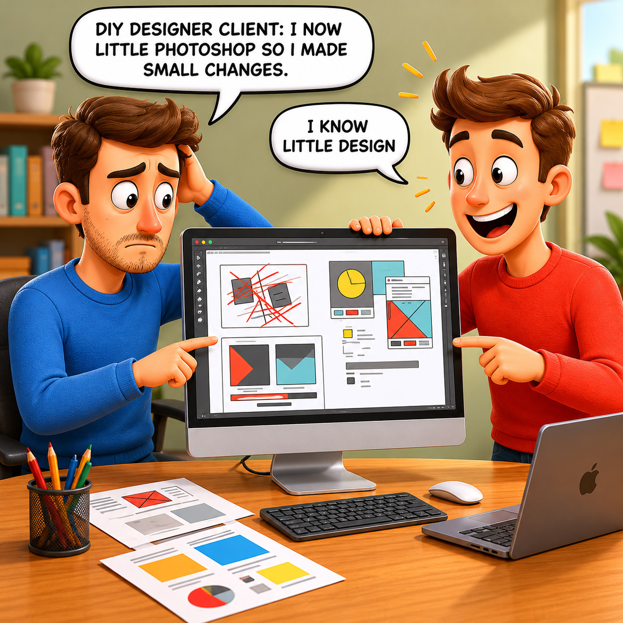
What Designers Say: “Glad you’re creatively involved. Let’s review the edits.”
What Clients Hear: “Your layout broke, alignment crashed, and fonts are now aliens… but it’s almost done!”
Funny Truth: Nothing is more dangerous than “I know little design.”
Bonus Line: Iteration 24: “Now let’s go back to the first one.”
10. Color Mode Chaos: "Why does the print look dull compared to my phone?"
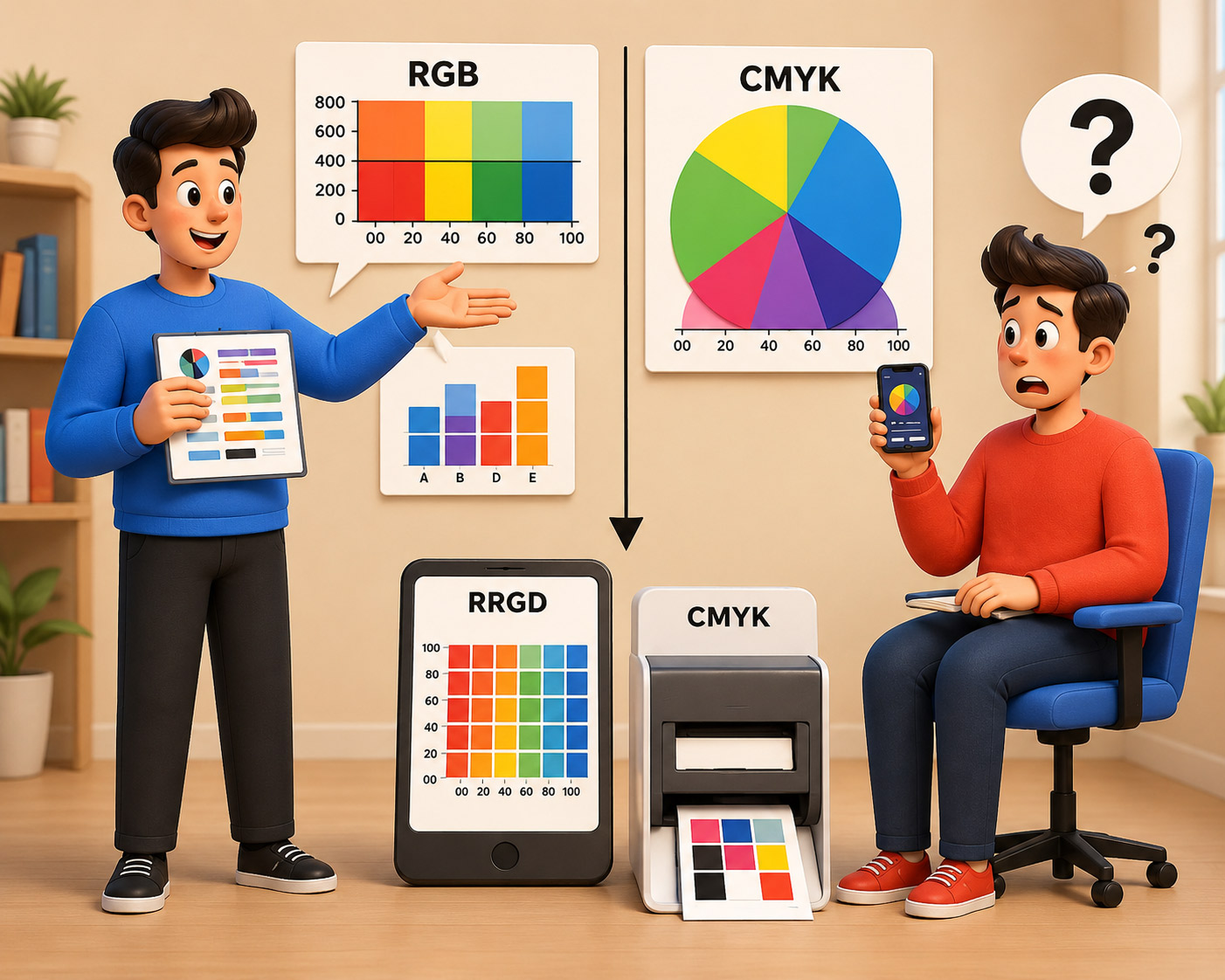
What Designers Say: “Digital uses RGB, print needs CMYK for accurate colors.”
What Clients Hear: “It’s your printer’s fault. Or maybe Mercury is in retrograde.”
Funny Truth: Expecting neon glow in CMYK print is like expecting popcorn from a toaster.
Bonus Line: “Can you print it brighter?” = Graphic designer’s nightmare fuel.
Conclusion
In the end, graphic design isn’t just about shapes, colors, or layers — it’s about communication, compromise, and a dash of chaos. These funny moments might leave designers rolling their eyes, but they also remind us why we love what we do: creating something meaningful out of madness. So here’s to all the blurry briefs, neon dreams in CMYK, and infinite font changes — may your coffee be strong, your feedback be clear, and your designs never get “just one more revision.” After all, laughter really is the best rebrand.