A Heritage Brand Reimagined for the Modern Snack Shelf
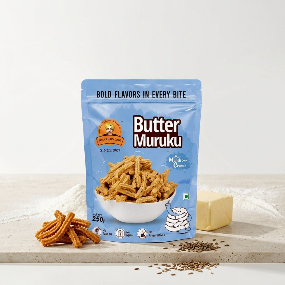
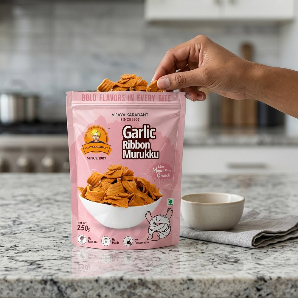
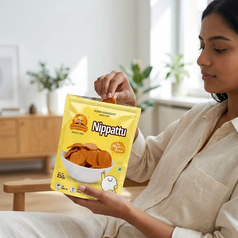
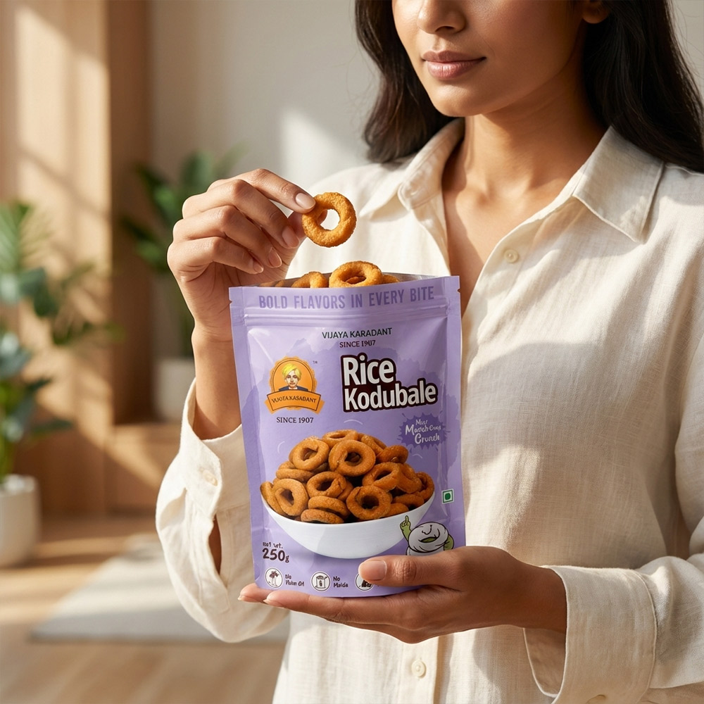
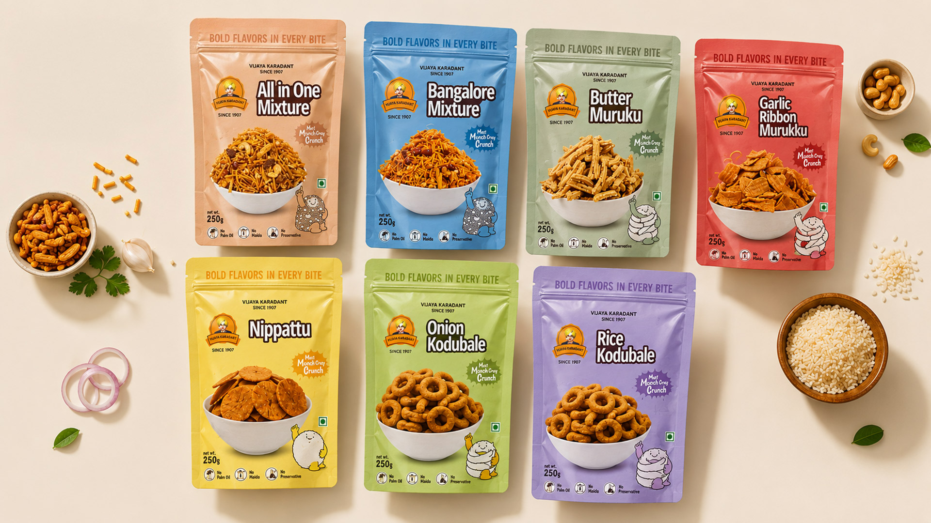
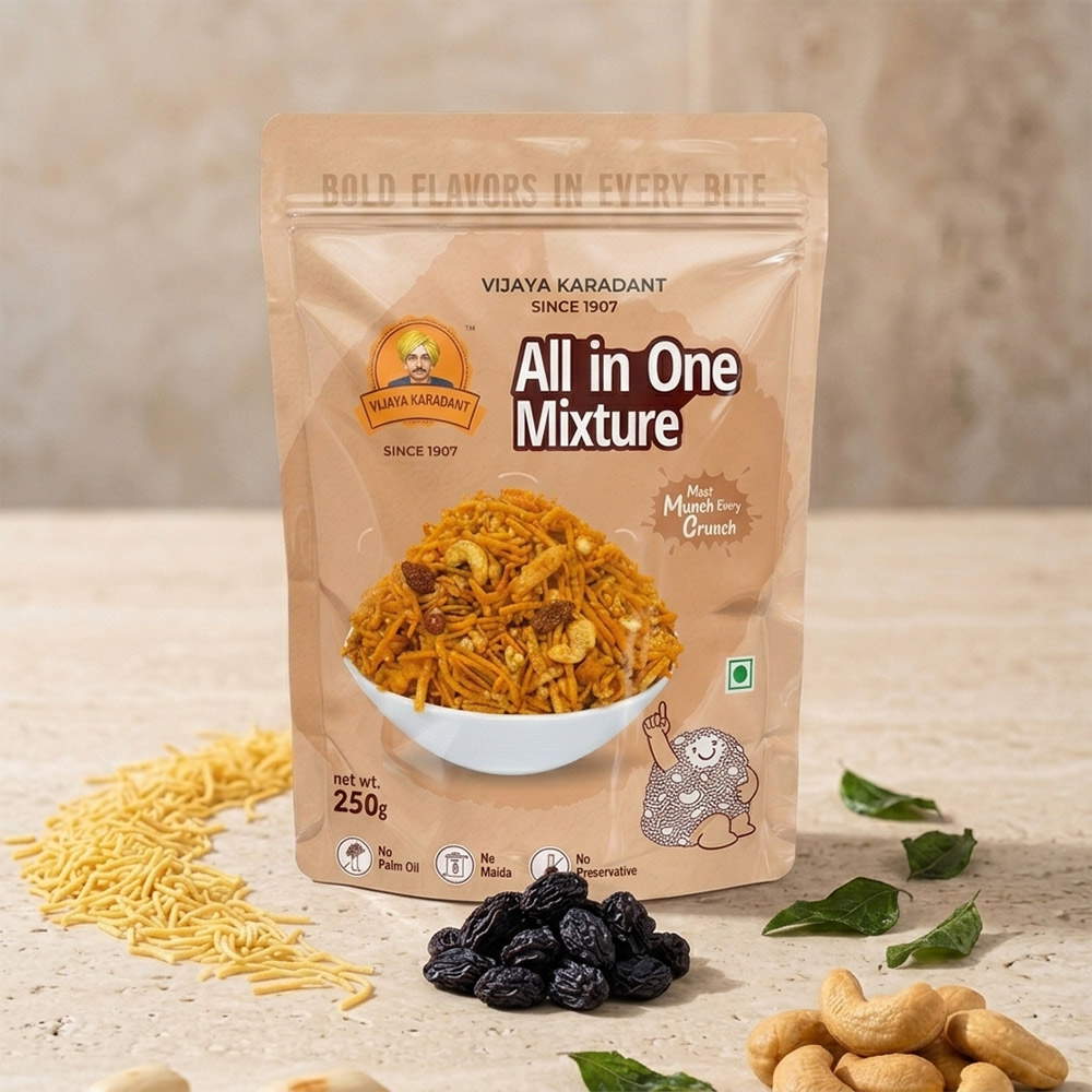
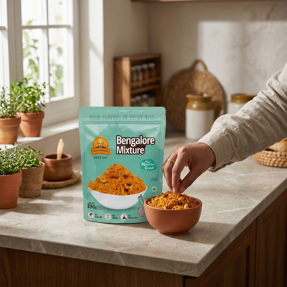
For over a century, Vijaya Karadant has been known for its authentic Karnataka snacks. Our challenge was to modernize the brand without losing the trust and familiarity that generations of consumers associate with it. The new packaging system was designed to create a vibrant, contemporary shelf presence while preserving the brand’s rich legacy. Instead of relying on complex graphics, we focused on a clean, minimal design language that allows the product to become the hero. Large product imagery, bold typography, and a consistent layout ensure that shoppers can instantly identify each variant, making purchase decisions quicker and easier.
Building a Colour-First Brand Architecture
One of the key strategies behind the redesign was creating a strong colour-coded packaging architecture. Every product variant is assigned a unique Pantone-inspired colour palette that reflects its flavour and personality while maintaining consistency across the entire range. The pastel-inspired backgrounds combined with bold product photography create a fresh and premium appearance that stands apart from the cluttered snack category. This systematic approach not only improves shelf visibility but also helps retailers, distributors, and consumers quickly differentiate between multiple SKUs, strengthening brand recall and creating a unified product family.
A Mascot That Brings Warmth and Brand Recall
To give the brand a distinctive personality, we introduced a playful hand-drawn mascot that appears across every pack. Rather than being a promotional character, the mascot acts as a subtle brand ambassador, bringing warmth, friendliness, and a touch of nostalgia to the packaging. Each illustration interacts with the individual product in a unique way, adding charm without distracting from the product itself. This creates an emotional connection with families and younger consumers while making the packaging instantly recognizable from a distance. The result is a memorable identity that balances heritage, simplicity, and modern retail appeal.
Design Highlights
- Modern redesign for a 100+ year heritage snack brand
- Unique Pantone-inspired colour system for every SKU
- Clean typography with strong product hierarchy
- Bold appetite appeal through hero product photography
- Playful mascot system that enhances brand recognition
- Scalable packaging architecture for future product extensions
- Designed for maximum shelf impact and easy flavour identification
- Print-friendly design with consistent branding across the product range