GullyTales – Packaging That Brought Childhood Back to Life
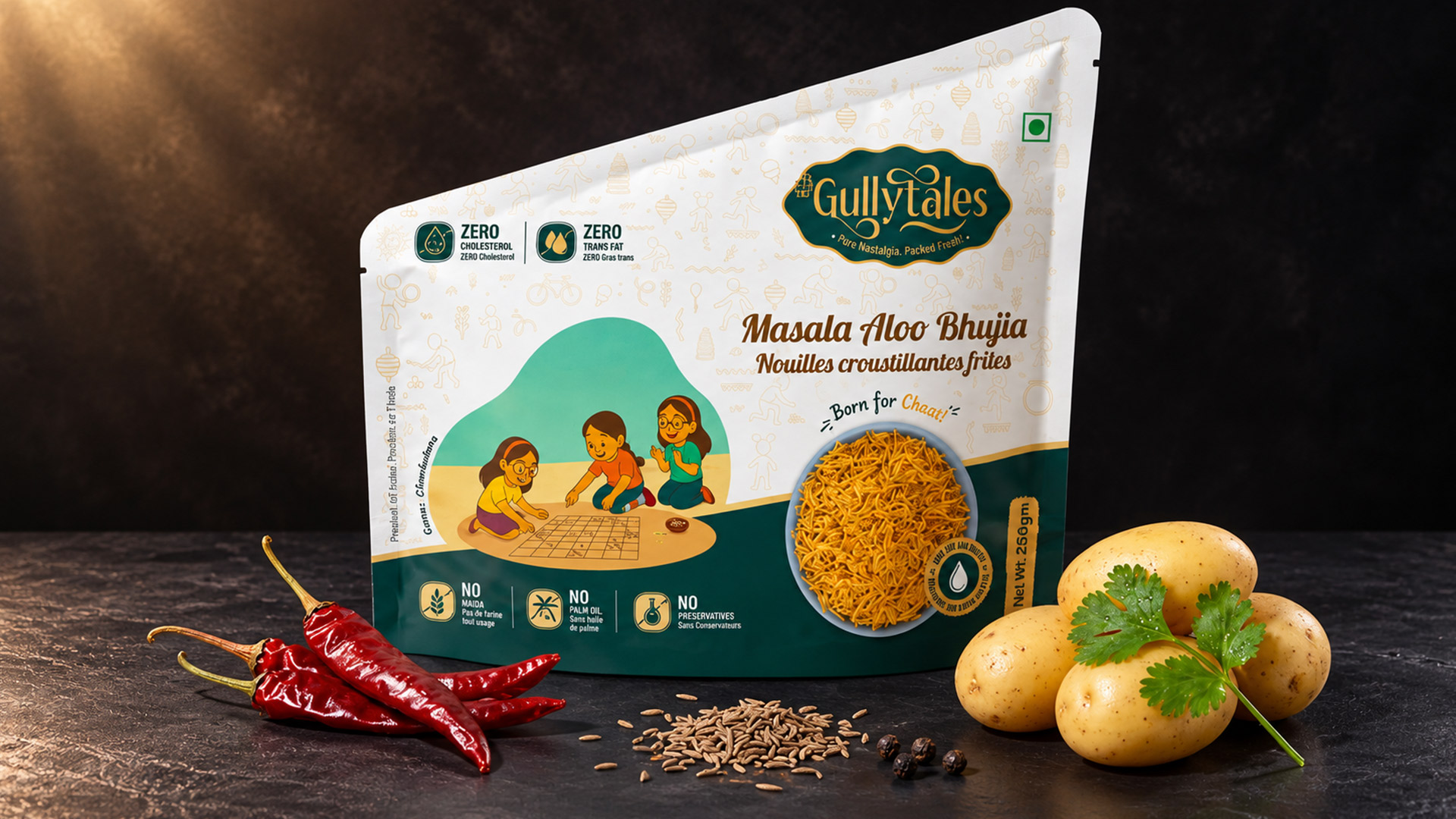
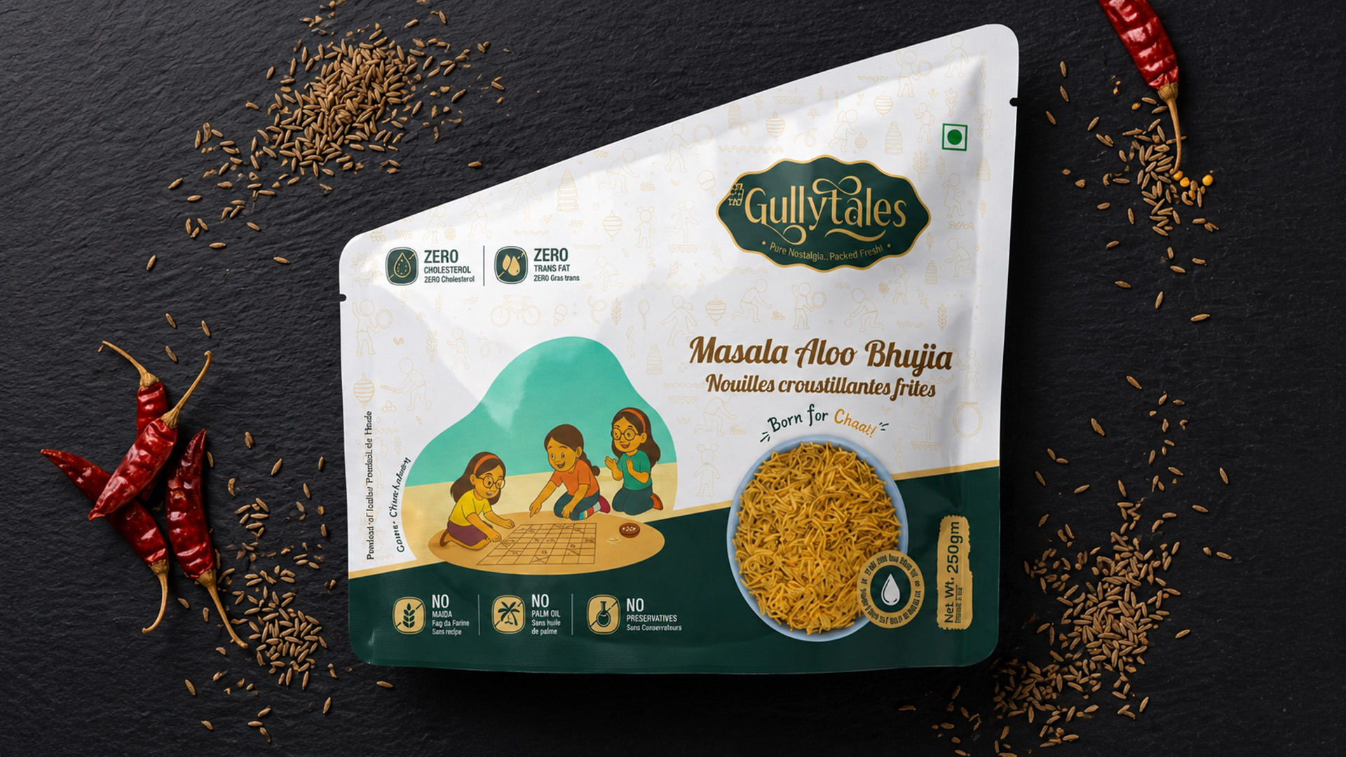
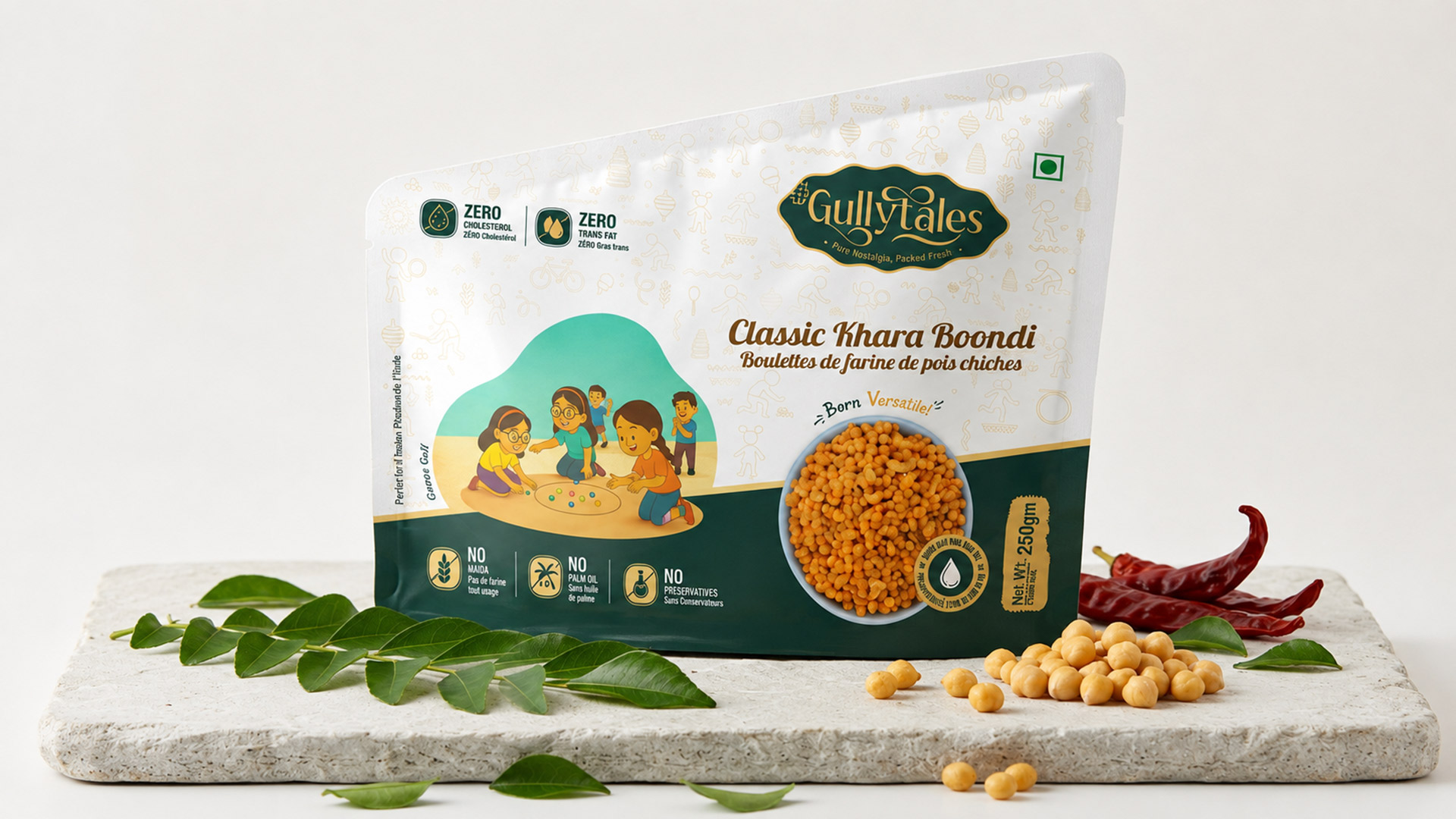
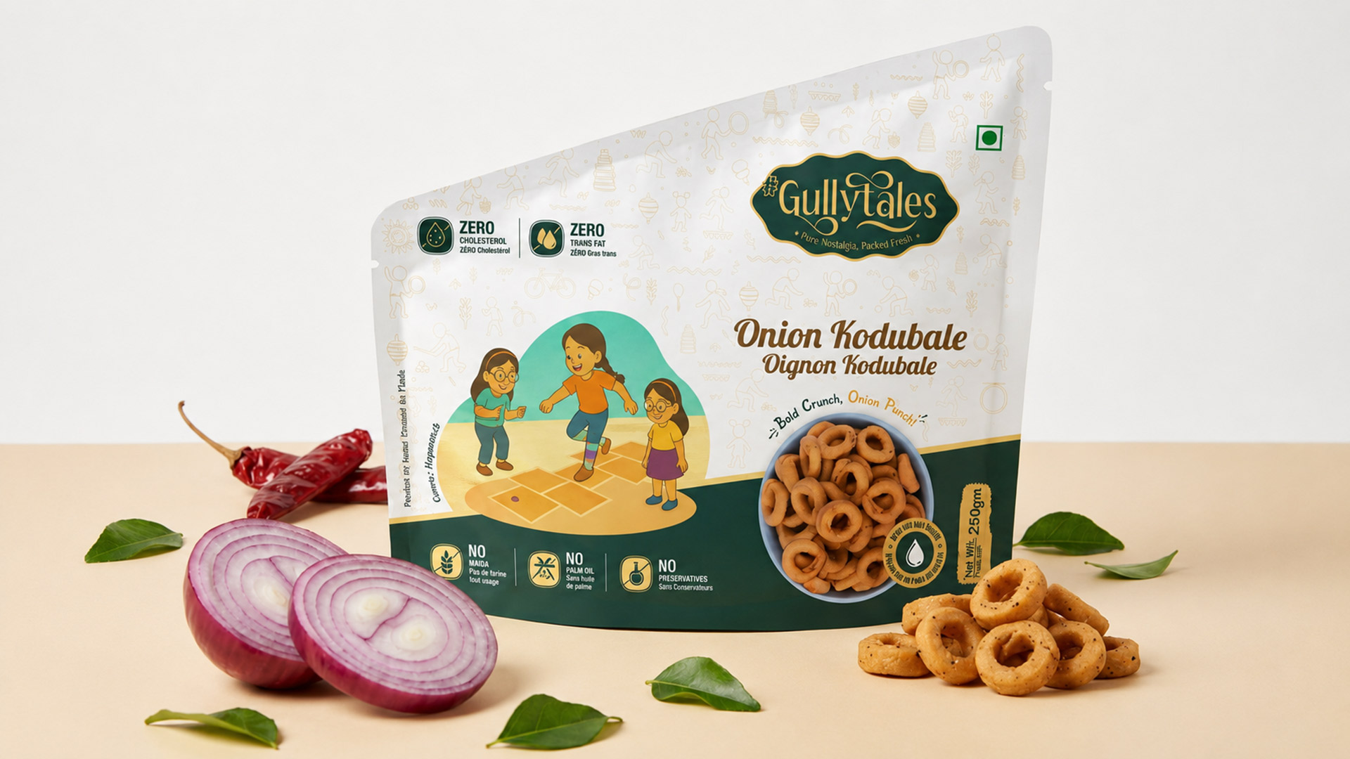
At Designtheme Innoventics, we believed GullyTales deserved to be more than just another Savories brand—it deserved to become a conversation. Instead of relying on typical food imagery and loud graphics, we built the entire brand around one powerful emotion: nostalgia. Every pack celebrates the forgotten joy of India’s 90s street games—Gilli Danda, Goli, Lagori, Buguri, Chakkabara, and more—games that once brought neighbourhoods alive but are now unfamiliar to many children growing up in the digital era. These custom illustrations weren’t added as decoration; they became the soul of the brand, reminding parents of their childhood while introducing a new generation to stories and traditions that deserve to be remembered. The tagline, “Pure Nostalgia. Packed Fresh.”, perfectly captured this emotional bridge between generations.
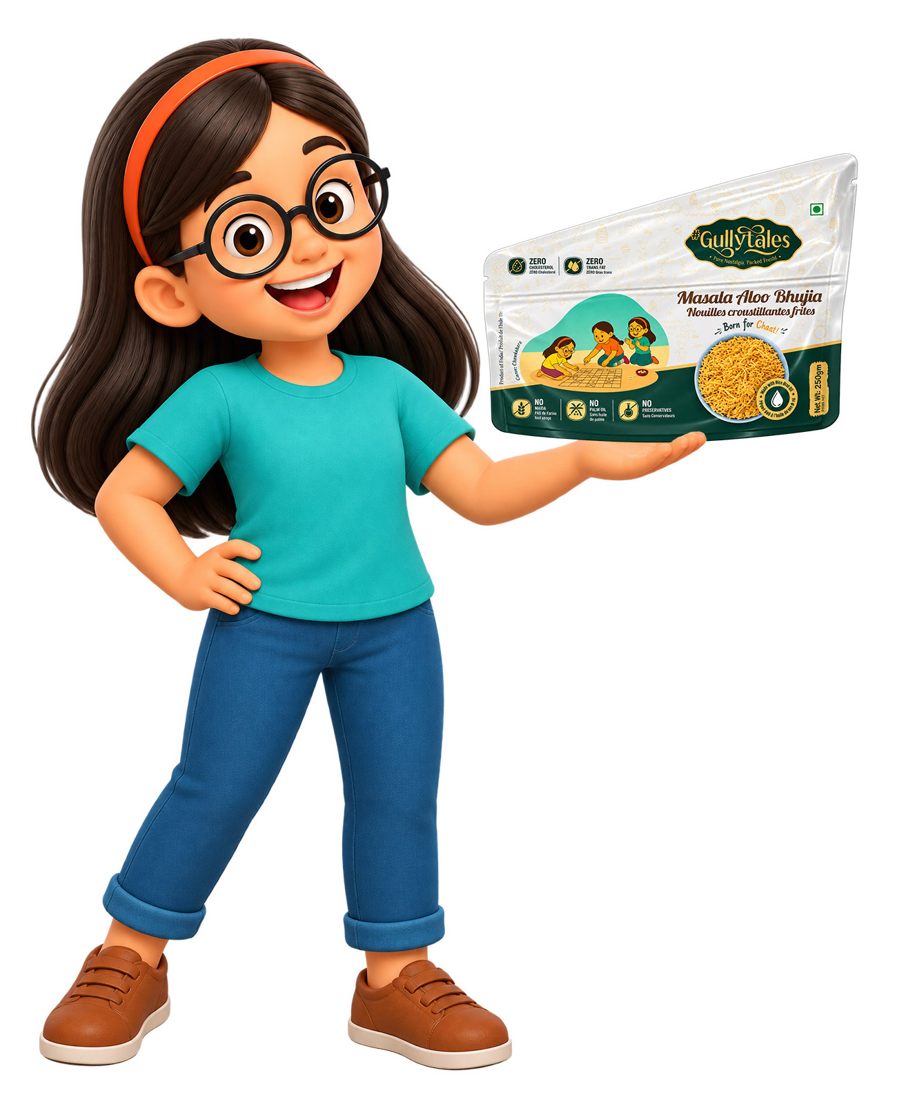
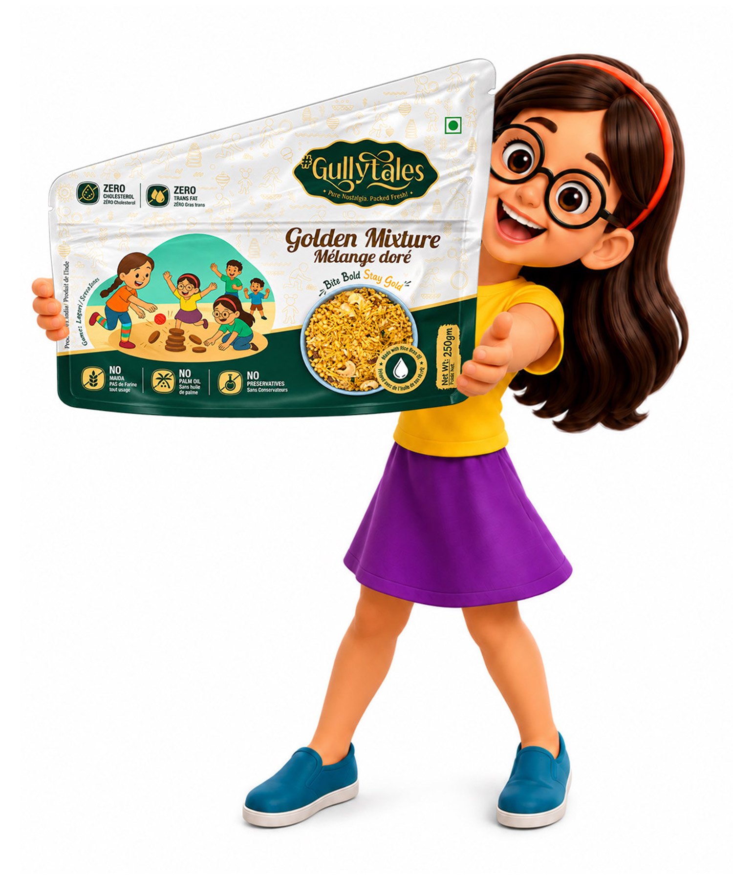
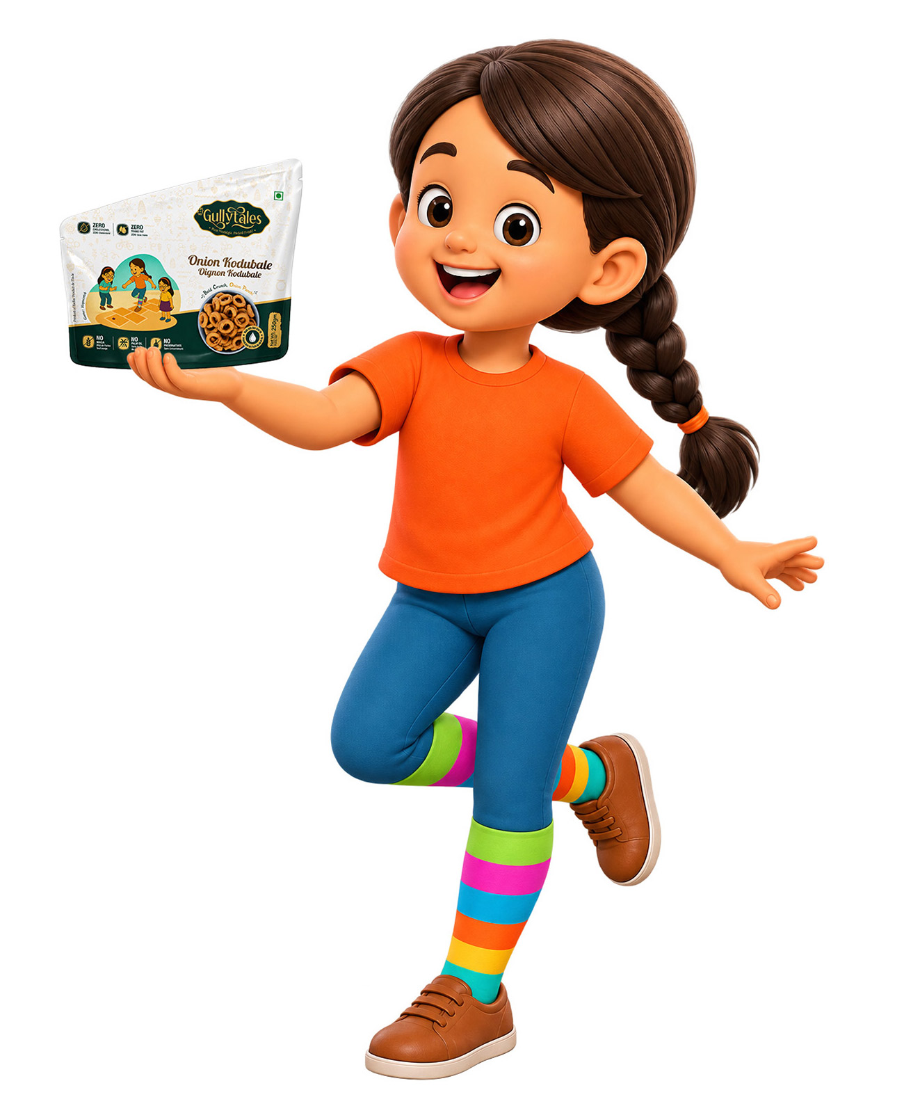
The packaging was intentionally designed with a clean, premium layout where the product remained the hero while the nostalgic storytelling unfolded naturally around it. A soft colour palette, elegant typography, and thoughtfully placed illustrations created a premium shelf presence without overwhelming the consumer. Every detail—from the mascots playing traditional games to the subtle background patterns and refined finishing—was carefully crafted to make consumers pause, smile, and reconnect with a forgotten memory. The result was a package that wasn’t just visually appealing; it sparked curiosity, encouraged conversations between parents and children, and transformed an everyday snack into a meaningful experience.
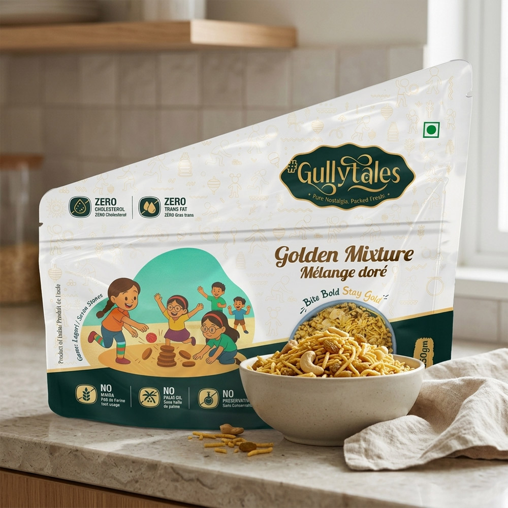
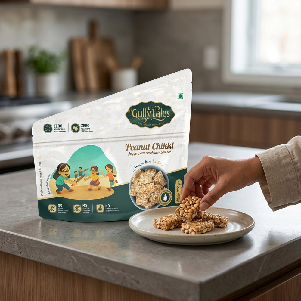
Designed for GullyTales, a U.S.-based Indian brand, the packaging aimed to connect with Indian families living abroad while introducing authentic Indian savouries through a story they could instantly relate to. For many first-generation Indians in the U.S., every pack became a nostalgic reminder of childhood evenings spent playing Gilli Danda, Lagori, Goli, Buguri, Chakkabara, and other timeless street games. For their children, who had never experienced these games, the illustrations became a conversation starter—bridging generations through stories, culture, and shared memories over a bowl of namkeen. By combining emotional storytelling with a clean, premium packaging design, GullyTales stood out on retail shelves, proving that packaging can do much more than sell a product—it can preserve heritage, spark conversations, and create a lasting emotional connection.